In addition to their obvious purpose and function, maps can be many things: educational and didactic tools, scientific tools, works of art, documents on political history - or all of that at once. Maps can be read as non-linear, non-narrative books, rich in information not only about the places and phenomena they present, but also about their compilers and their views of the world. Almost no map, except the purely physical-geographical ones, can be observed independently of its cultural-political dimension, context and subtext. If we map out religions, only one step separates us from connecting religious distribution with the economic aspects of the regions shown. If we map out diseases, at the same time we have said something about states and people, political arrangements, medicine and health, and the effectiveness (or lack) of public programs for disease prevention and treatment.
Alexander Keith Johnston (1804-1971) was a Scottish geographer, cartographer, engraver, lexicographer and publisher from Edinburgh. Together with his brother William, he founded the cartographic company W. & A. K. Johnston, which printed numerous maps and several atlases since the 1840s. Here we bring three of his maps.
Religions:
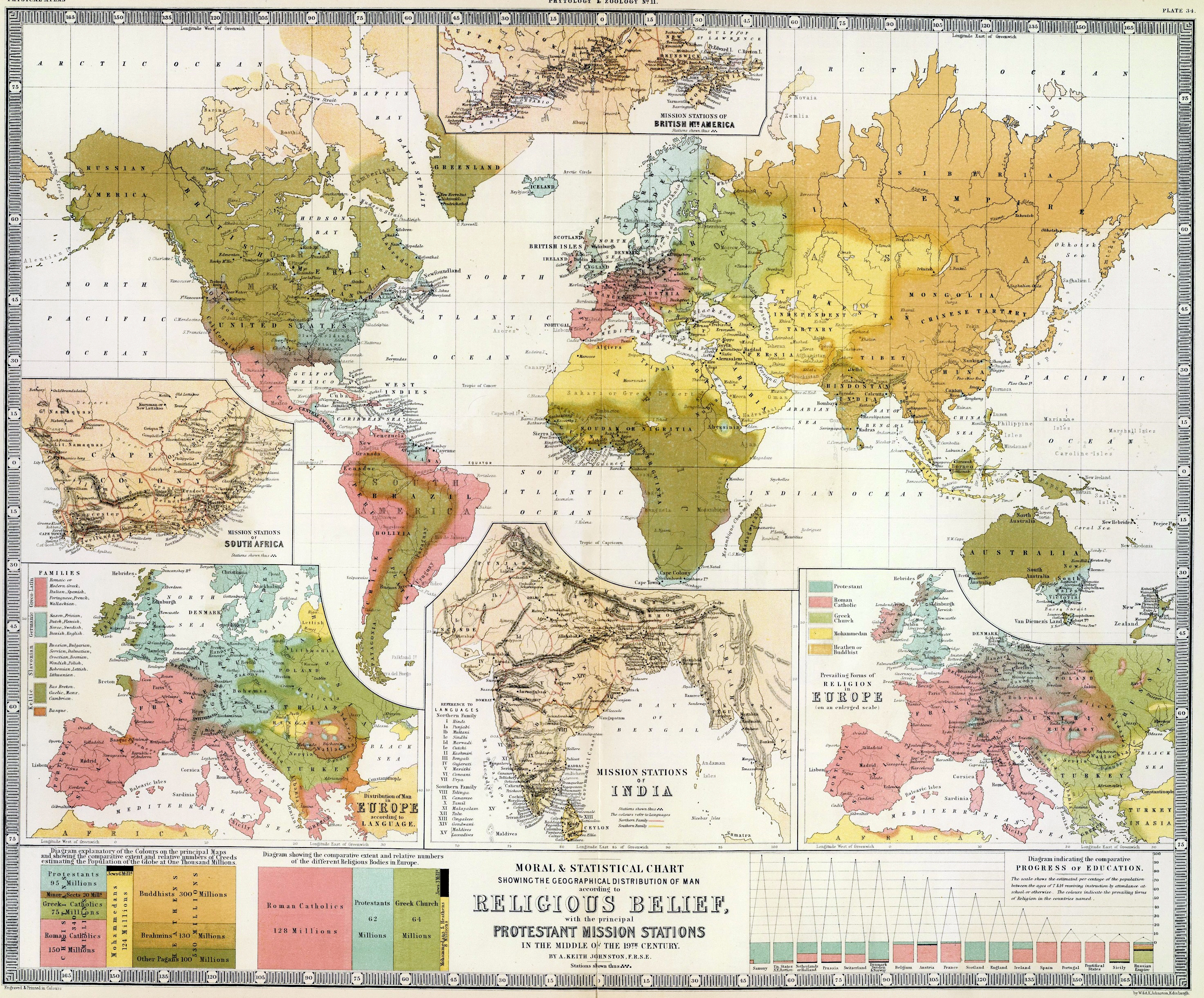
A moral and statistical chart showing the geographical distribution of people in accordance with their religious beliefs, with the most important Protestant missionary offices, in the mid-19th century. The map was compiled by Alexander Keith Johnston, a member of the Edinburgh Royal Society. Engraved and printed by William Blackwood and Sons, based in Edinburgh and London. Published May 1, 1854
In addition to religions, this map contains other interesting data, such as a language map of Europe, and an "education progress chart" (percentage of the population aged 7 to 14 considered to be educated at school or from other sources, in the lower right corner). In the lower left corner, there is a legend that explains which colors refer to which religions, and at the same time shows the number of people of each religion, noting that the current population of the planet is estimated at one thousand million inhabitants, which means - one billion.
Protestant missions are shown in particular detail in British North America, India and South Africa, as separate maps.
 Click on the map of religions to see it enlarged.
Plants:
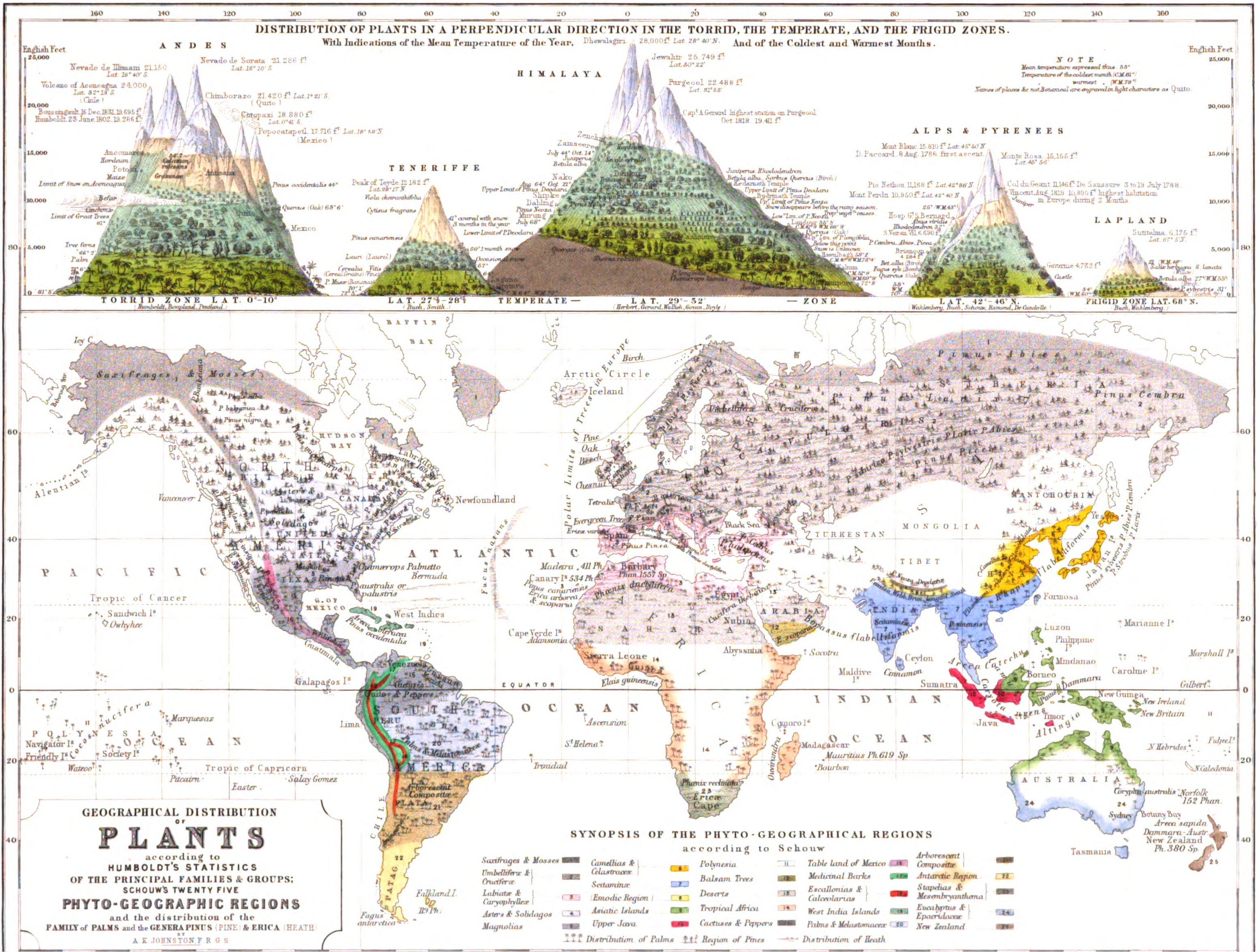
Geographical distribution of plants, and distribution of plants in the vertical direction in hot, temperate and cold climatic zones, with marked average annual temperatures, and the coldest and warmest months. The map was published in 1848.
 Click on the map of plants to see it enlarged.
Diseases:
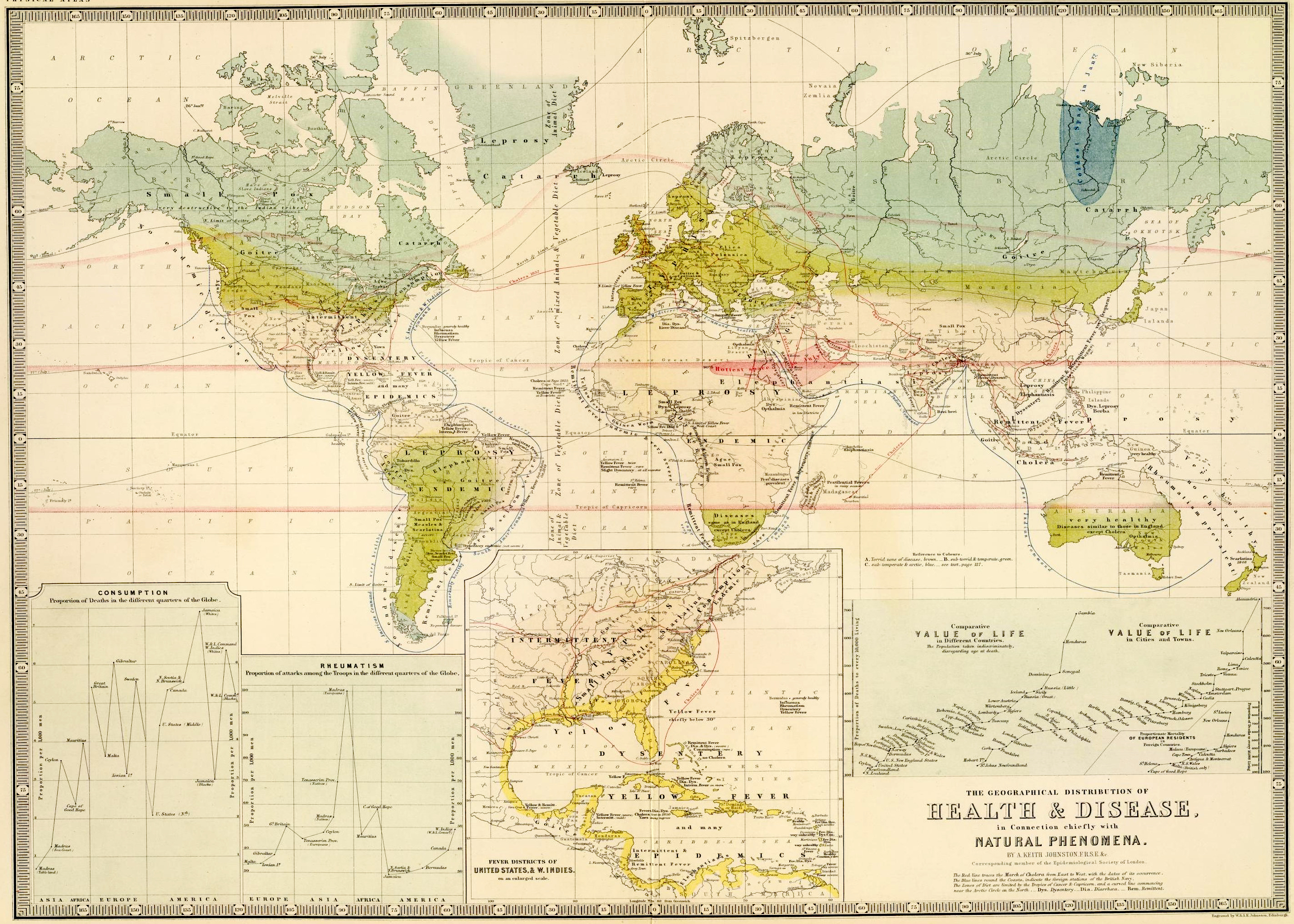
The map of health and infections, primarily in connection with natural phenomena, was created in 1856 in accordance with the data of the Royal Epidemiological Society from London. In the lower right corner of the map there is a Graph of the comparative value of life in the countries, as well as a Graph of the comparative value of life in cities and towns. The map also contains a note that the red line represents the movement of cholera from east to west, with the dates when it appeared. The blue lines along the coast represent foreign outposts of the British Navy. The nutrition zones are defined by the crab and goat reversal, and a curved line that begins near the Arctic Circle in the north. In the lower left corner are charts that show tuberculosis ("consumption") and rheumatism.
 Click on the map of diseases to see it enlarged.
Maps can be read as non-linear, non-narrative books.

